Usage: Difference between revisions
mNo edit summary |
|||
| Line 22: | Line 22: | ||
==Usage by Hour== |
==Usage by Hour== |
||
On the Control Pages there is a break down of the usage by hour, this is shown as a table, and shows the past 12 days or so of upload and download for each hour. |
On the Control Pages there is a break down of the usage by hour, this is shown as a table, and shows the past 12 days or so of upload and download for each hour. This table will be updated very soon after each hour. |
||
[[File:Usage-Hour-Table.png|none|frame|Usage per hour, eg on 20th April between 8am and 9am there was 123M downloaded]] |
[[File:Usage-Hour-Table.png|none|frame|Usage per hour, eg on 20th April between 8am and 9am there was 123M downloaded]] |
||
Revision as of 12:29, 21 April 2015
Most of our broadband and mobile packages are usage based. You can view the usage being used on the Control Pages in near real-time. The usage information isn't just for billing purposes, it is very useful in diagnosing problems, or seeing when usage is used the most.

Accessing This Feature
Access is via the Control Pages as follows:
- Log in to the Control Pages with your xxx@a login
- Click on the line you want to view
- Click on Graph, or the 'View Usage' button
Home::1 Remaining Quota
The remaining quota (usage) on the Home::1 service is also shown in a number of places. Please see the Home::1 page for more information.
Usage by Month
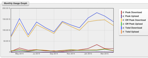
On the Control Pages there is a break down of the usage by month, this is shown as a table and as a graph. The table includes the 'uptime' of the line. The uptime is a percentage of the whole month and is based on our per-second monitoring of the line.


Usage by Day
Also shown is the usage per day from the past 2 weeks or so... This table includes a Packet Ratio column. This is a ratio of packets sent and received from your line. This statistic isn't overly useful, but may show of a line is being DOS'd. Typically, the figure would be around 100% +/- 30

Usage by Hour
On the Control Pages there is a break down of the usage by hour, this is shown as a table, and shows the past 12 days or so of upload and download for each hour. This table will be updated very soon after each hour.

Usage on the Monitoring Graphs
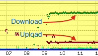
The CQM Graphs will also show usage. Typically, dark green dots or lines is Download, and dark red is upload. Graphs are kept indefinitely.
