CQM Graphs: Difference between revisions
Roadhog863 (talk | contribs) m (Fix dead link) |
|||
| (82 intermediate revisions by 5 users not shown) | |||
| Line 1: | Line 1: | ||
<indicator name="Diagnostics">[[File:menu-spanner.svg|link=:Category:Diagnostic Tools|30px|Back up to the Diagnostics Category]]</indicator> |
|||
The FB6000 [[L2TP]] router provides us with Continuous Quality Monitoring (CQM). This allows us to track the quality of each and every connection in great detail. The router itself produces the graphs in real time, and can also provide csv files with accurate data for each graph. |
|||
The FireBrick 6000 routers we use provide us with Continuous Quality Monitoring of every broadband circuit. This allows us to track the quality of each and every connection in great detail. The router itself produces the graphs in real time, and can also provide csv files with accurate data for each graph. |
|||
Customers and Staff can view these graphs in near real time (updated every 100 seconds), and can view historical graphs. |
|||
Customers and staff can view these graphs in near real time (updated every 100 seconds), and can view historical graphs. |
|||
{{CPbox|#Click on the line you want to view |
|||
#Clicking on the graph again will show 7 days worth of graphs with options there to view 30 and 60 days}} |
|||
==How does it work?== |
==How does it work?== |
||
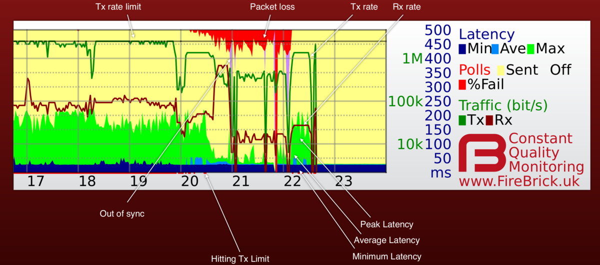
Our router sends an LCP echo (like a ping) every second while a line is active. Your router replies. We track how long it takes for each reply to arrive, and how many are lost. These results are collated into 100 second samples and shown as a graph like the one on this page. The graph shows us lots of information about the line, and gives a history covering the last 24 hours. |
Our router sends an LCP echo (a bit like a ping) every second while a line is active. Your router replies. We track how long it takes for each reply to arrive, and how many are lost. These results are collated into 100 second samples and shown as a graph like the one on this page. The graph shows us lots of information about the line, and gives a history covering the last 24 hours. |
||
==What information is on the graph?== |
==What information is on the graph?== |
||
[[File:Cqm-screen-shot-notes.png]] |
[[File:Cqm-screen-shot-notes.png|1200px|CQM Graphs]] |
||
Each column (pixel) represents 100 seconds of samples. The hour of day is shown at the bottom, and the day and date shown next to midnight in the graph. There is additional text superimposed on the graph such as a circuit ID. |
Each column (pixel) represents 100 seconds of samples. The hour of day is shown at the bottom, and the day and date shown next to midnight in the graph. There is additional text superimposed on the graph such as a circuit ID. |
||
===A note on Tx/Rx download/upload=== |
|||
[[File:Cqm-key.png|right|frame|Graph Key]] |
|||
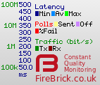
As stated in the image above, the dark red is customer uploading, and the darker green is customer downloading. The key on the right does label these as Red=rx Green=tx. As the graph is created at the AAISP side, the Tx/Rx is the view from AAISP, i.e. Rx is what AAISP has received from the customer. |
|||
The colours may vary and we even allow users to configure colours individually (useful for people with colour blindness, etc.). It is also possible for us to show graphs with only some of the fields which can make some information clearer (see [[#CQM Graph options]]). |
|||
===Pins=== |
|||
The colours may vary and we even allow users to configure colours individually (useful for people with colour blindness, etc). It is also possible for us to show graphs with only some of the fields which can make some information clearer. |
|||
Staff are able to add 'pins' to graphs. This is a useful way of adding notes to particular times on a graph. We used to let customers add their own pins, but this feature has been removed for the time being. |
|||
=ICMP Graphs= |
|||
Optionally, staff can enable ICMP ping graphs. These will graph a normal ping to the customer WAN IP address. They tend to have a salmon coloured background: |
|||
[[File:Cqm-icmp.png|none|frame|An graph created from ICMP Pings to a WAN address]] |
|||
Customers may need to set their firewall to allow pings from us; currently we ping from 90.155.53.8. |
|||
Sometimes a normal CQM graph may have a salmon background - this would usually be when the line is logged in to our test LNS. |
|||
=CQM Examples= |
=CQM Examples= |
||
===Lots of Upload=== |
===Lots of Upload=== |
||
[[File:CQM1.png]] |
[[File:CQM1.png|none|frame|Lots of upload at the end of the day]] |
||
(Not an ADSL fault.) The example above shows a line with occasional short uploads causing spikes in peak latency, and then a sustained upload starting at around 6pm and causing high latency (a queue in the router). At 8pm there was more upload filling the link causing higher latency still and some loss (normal when the link is full). This is normal. Also see: [[Packet Loss]] |
|||
Here is another, an FTTC line filling the up link whilst doing a backup (10 Mbit/s) |
|||
[[File:CQM-FTTC-upload.png|none|frame|Lots of upload in the morning - a backup without any traffic shaping on the client end]] |
|||
This line is doing a large backup from just before 6am. The dark red horizontal line shows the traffic, during this time there is lots of packet loss (red) and the light blue at the bottom is showing high latency. So, whilst the backup is happening the line has about 50% packet loss and around 300 ms of latency. Using the line for things like web browsing at this time will be slow and sluggish. However, this is not a fault per-se. It is normal for a line to appear slow when it's being filled with traffic. However, this traffic may be unknown, it may not be a backup, but could be a virus or peer-to-peer traffic. You can do a [[Traffic Capture]] to see what the traffic is, or ask Support to Help. |
|||
The example above show a line with occasional short uploads causing spikes in peak latency, and then a sustained upload starting at around 6pm and causing high latency (queue in the router). At 8pm there was more upload filling the link causing higher latency still and some loss (normal when the link is full). This is normal. Also see: [[Packet Loss]] |
|||
===Redcare=== |
===Redcare=== |
||
| Line 34: | Line 59: | ||
===Congestion within BT=== |
===Congestion within BT=== |
||
[[File:Lcp8a.png]] |
[[File:Lcp8a.png]] |
||
[[File:Cqm-exchange-congestion.png]] |
|||
This is down to congestion within the BT core network, this could be at the Exchange, BRAS, or the VP. It would be seen on multiple lines. |
This is down to congestion within the BT core network, this could be at the Exchange, BRAS, or the VP. It would be seen on multiple lines. |
||
=== |
===Congestion within TT=== |
||
[[File:CongestionTT.png]] |
|||
BT are not alone in suffering from congestion. This graph show congestion affecting TT lines on an exchange. (BT lines on the same line were unaffected by this.) |
|||
===Lots of Drops=== |
|||
[[File:Cqm-dropping2.png]] |
|||
This line does have a fault. It is dropping sync throughout the day. In this type of case, go through the usual checks, and AAISP will report a fault, which will probably need a BT SFI engineer to atend site. |
|||
===Only Dropping during the day=== |
|||
[[File:CQM4.png]] |
[[File:CQM4.png]] |
||
If a line is dropping during the day, and maybe just Monday to Friday, then it's probably not going to be an upstream problem. This could be caused by interference |
(Probably not an ADSL Fault.) If a line is dropping during the day, and maybe just Monday to Friday, then it's probably not going to be an upstream problem. This could be caused by interference or bad wiring on site. Check things like the phone line and extensions. Put the router into the master socket and unplug all other phones. Maybe change filter. |
||
=== |
===Interleaving being applied=== |
||
[[File:Interleaving.png|none|frame|This line dropped shortly after 11am, and reconnected with higher latency. This could be interleaving being applied]] |
|||
[[File:CQM-heavyloss.png]] |
|||
For more info see: [[Interleaving]] |
|||
===Heavy packet loss=== |
|||
This is showing more than 50% packet loss with no usage. A problem! Also see [[Packet Loss]] |
|||
Also see [[Packet Loss]] |
|||
[[File:CQM-heavyloss.png|none|frame|This is showing more than 50% packet loss with no usage. A problem!]] |
|||
[[File:Cqm-packetloss-contactfault.png|none|frame|This line has loss due to a battery contact fault. A copper line test suggests that this should be reported to Openreach as a fault.]] |
|||
[[File:Cqm-VPcongestionOrfault.png|none|frame|Packet loss when a downloading but not filling the line]] |
|||
This is a rather strange one. There is packet loss when downloading, however the download is not filling the link, but there is still loss. This is unusual. This turned out to be congestion on the virtual path within BT, or it may have been misconfigured. It took our escalation staff three months to convince BT that the fault was within their network. |
|||
===Phone line half connected - DIS in one leg=== |
|||
[[File:CQM-FTTC-DIS-in-one-leg.png|none|frame|FTTC running on just a single leg/wire]] |
|||
Here we have a perfectly good FTTC, running at 80M. However, in the evening the line goes rather crazy! Here is what happened: |
|||
*18:20 The end user was doing some tidying up of wiring and accidental disconnected one of the wires that make up the pair used for the phone line |
|||
**The line dropped a few times and reconnected, but the sync speed dropped to from 20 Mbps up and 80 Mbps down to 600 kbps up and 23 kbps down! |
|||
*The line continued working for a short while, up until: |
|||
*19:20 where a backup job was started which started uploading data |
|||
**As the sync speed was so low, the backup filled the link and high latency (blue) ensued. |
|||
**At this point, the end user noticed something was not right. |
|||
*Looking at the times on the graph gave a clue to the end user what had happened. They had accidentally disconnected one of the wires of the phone line and surprisingly the FTTC was actually still in sync, logged in and passing traffic - just at low speeds. |
|||
*20:00 The wiring was repaired and the FTTC came back in to sync at the usual high rates. |
|||
===Faulty Switch on the LAN=== |
===Faulty Switch on the LAN=== |
||
[[File:CQM-netgearswitch.png]] |
[[File:CQM-netgearswitch.png]] |
||
Not an ADSL Fault. This latency and loss was caused by a fault Netgear switch on the LAN side of a Vigor router! The switch had failed to the point where it wouldn't talk gigabit but would talk 100M unreliably. Guess it was maxing router CPU perhaps. It's unknown how this affected the Vigor, but perhaps the switch was faulty enough to upset the Vigor causing it to delaying or not replying to the LCP echos. In this case unplugging the LAN side of the router would show a normal looking graph, indicating the fault is somehow caused by something on the LAN. |
(Not an ADSL Fault.) This latency and loss was caused by a fault Netgear switch on the LAN side of a Vigor router! The switch had failed to the point where it wouldn't talk gigabit but would talk 100M unreliably. Guess it was maxing router CPU perhaps. It's unknown how this affected the Vigor, but perhaps the switch was faulty enough to upset the Vigor causing it to delaying or not replying to the LCP echos. In this case unplugging the LAN side of the router would show a normal looking graph, indicating the fault is somehow caused by something on the LAN. |
||
===Line dropped and speed changed=== |
|||
[[File:CQM-speed-change.png|none|frame|line dropped and came back slower and with higher latency]] |
|||
This FTTC line dropped at 01:50, and came back within a minute or two, however, the speed has dropped (horizontal black line at the top) and also the latency (blue at bottom) has increased. There could be a fault here, but in this case we can clearly see that something has happened. |
|||
===Affect of adjusting the 'rate' setting=== |
|||
[[File:Cqm-ratedrop.png|none|frame|Example of changing the line rate from 100%-95% reduced average latency when filling the link when downloading]] |
|||
===Running a speed test every 15 minutes=== |
|||
[[File:Cqm-speedtest15mins.png|none|frame|Running an automated speed test every 15 minutes - not a fault, but the test fills the link and causes loss so will be service affecting]] |
|||
==Other Examples== |
==Other Examples== |
||
| Line 63: | Line 132: | ||
![[File:Cqm-long-grass.png]] |
![[File:Cqm-long-grass.png]] |
||
|'''Long grass''' |
|'''Long grass''' |
||
Some issues can be subtle, affecting latency on idle lines like this with occasional peaks. Even low levels of jitter like this can disrupt VoIP and can indicate a wide problem such vendor equipment bugs or the start of back-haul congestion. |
Some issues can be subtle, affecting latency on idle lines like this with occasional peaks. Even low levels of jitter like this can disrupt VoIP and can indicate a wide problem such vendor equipment bugs or the start of back-haul congestion. We have seen some routers (Asus) behave like this, the line is clean when swapping the router. |
||
|- |
|- |
||
|[[File:Cqm-latency.png]] |
|[[File:Cqm-latency.png]] |
||
| Line 70: | Line 139: | ||
|[[File:Cqm-dropping.png]] |
|[[File:Cqm-dropping.png]] |
||
|Going off line is shown in purple, and this is often associated with packet loss (red). Where a line has occasional drops they are shown as purple lines. However in some case a line can deteriorate over a period of time, staying on line less and less until solid purple (off line). On the live graphs a line that is currently off line has a red square in the bottom right corner where as a line that is on-line has a green square. |
|Going off line is shown in purple, and this is often associated with packet loss (red). Where a line has occasional drops they are shown as purple lines. However, in some case a line can deteriorate over a period of time, staying on line less and less until solid purple (off line). On the live graphs a line that is currently off line has a red square in the bottom right corner where as a line that is on-line has a green square. |
||
|- |
|- |
||
|[[File:Cqm-congestion.png]] |
|[[File:Cqm-congestion.png]] |
||
| Line 96: | Line 165: | ||
|[[File:Cqm-notes.png]] |
|[[File:Cqm-notes.png]] |
||
|Purple on the graph is off line, and this can be short blips if a line loses sync or longer. Notes (pins) are often added to graphs to explain why a line is off line if we know, especially when we are investigating a fault. The notes on this graph told when the BT engineer arrived and left. |
|Purple on the graph is off line, and this can be short blips if a line loses sync or longer. Notes (pins) are often added to graphs to explain why a line is off line if we know, especially when we are investigating a fault. The notes on this graph told when the BT engineer arrived and left. |
||
|[[File:Cqm-heating-small.png]] |
|||
| |
|||
|'''Regular drops repeating every day''' e.g. Central Heating causing drops. [[:File:Cqm-heating.png |View a week of these graphs]] Here there is interference as the central heating goes on, the drops are regular - twice a day, at the time the heating goes on. This actually highlighted a fault in the central heating for this customer as the graphs showed no drops for 2 days running! |
|||
| |
|||
|} |
|} |
||
===Regular evening drops=== |
|||
Historical graphs are kept which makes it easy to see patterns is line problems. Here we can clearly see that the line is being affected by something causing it to drop in the evenings. This could be something local causing interference and is less likely to be a PSTN problem. This could be something electrical being used in the evenings, such as putting the dishwasher on after dinner. Knowing that a line drops regularly at a specific time will help diagnose the source of the problem for example, checking what electrical devices are used in the evening. |
|||
[[File:CQM-evening-drops.png|none|200px|Evening Drops]] |
|||
===Faulty Card in a TalkTalk LTS=== |
|||
[[File:Cqm-faulty-lts-card.png|none|800px|Card in a TalkTalk LTS ]] |
|||
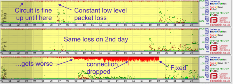
Here we have three days of graphs, you can see packet loss starting at around 2:50AM, which then gets worse two days later and is then fixed. |
|||
This was a faulty line card in a TalkTalk LTS - Only a small number of circuits were affected with packetloss due to this though. |
|||
The time ties in with logs from TalkTalk's LTS: |
|||
<syntaxHighlight> |
|||
8 alarms currently active |
|||
Alarm time Class Description |
|||
2023-06-29 02:57:46 BST Minor FPC 9 Minor Errors |
|||
2023-06-29 02:52:29 BST Minor FPC 1 Minor Errors |
|||
2023-06-29 02:52:25 BST Minor FPC 10 Minor Errors |
|||
2023-06-29 02:52:23 BST Minor FPC 8 Minor Errors |
|||
2023-06-29 02:52:22 BST Minor FPC 11 Minor Errors |
|||
2023-06-29 02:52:22 BST Minor FPC 0 Minor Errors |
|||
2023-06-29 02:52:22 BST Minor FPC 3 Minor Errors |
|||
2023-06-29 02:52:02 BST Major FPC 10 Major Errors |
|||
</syntaxHighlight> |
|||
From 9AM on day 3, the interface that we have with TalkTalk started reporting input discards. |
|||
[[File:Discards.jpg|none|400px|Interface discards ]] |
|||
The faulty line card was taken out of service, and the packet loss was no longer. |
|||
The incident was: https://aastatus.net/42546 |
|||
=Other Information= |
=Other Information= |
||
| Line 127: | Line 231: | ||
===I pay for usage - what is this monitoring costing me?=== |
===I pay for usage - what is this monitoring costing me?=== |
||
The usage based tariffs are metered based on IP traffic. They do not include LCP traffic at all, so these LCP echos are not costing you anything. They do use some of your bandwidth. One ATM cell (53 bytes) is sent each second. On an 8M line this is 0.005% of your downlink bandwidth. Even with limited uplink such as |
The usage based tariffs are metered based on IP traffic. They do not include LCP traffic at all, so these LCP echos are not costing you anything. They do use some of your bandwidth. One ATM cell (53 bytes) is sent each second. On an 8M line this is 0.005% of your downlink bandwidth. Even with limited uplink such as 250kbit/s, only a tiny fraction of a percent of the bandwidth is used for the monitoring. |
||
===I have a firewall - will this stop the graphs working?=== |
===I have a firewall - will this stop the graphs working?=== |
||
| Line 134: | Line 238: | ||
===Can you really ping every line every second?=== |
===Can you really ping every line every second?=== |
||
The FireBrick FB6000 platform is designed to send and accurately time each LCP packet even when fully loaded. So, yes we can. |
The FireBrick FB6000 platform is designed to send and accurately time each LCP packet even when fully loaded. So, yes we can. |
||
=CQM Graph options= |
=CQM Graph options= |
||
The control pages have a number of options to allow the graphs shown to be refined. These are shown simply as 8 input boxes. If all empty then the standard graph is |
The control pages have a number of options to allow the graphs shown to be refined. These are shown simply as 8 input boxes. If all input boxes are empty then the standard graph is shown for lines. The standard graph shows 8 traces. You can however input control strings in to these to define up to 8 separate graphs to be displayed instead. This can be particularly useful if you are colour blind, for example. It also allows simplification of graphs which may be rather cluttered, e.g. separating usage from latency in to separate graphs. |
||
[[File:Clueless-graph-options.png|border]] |
[[File:Clueless-graph-options.png|border]] |
||
The checkbox to the left of the 8 input boxes controls whether the hours of daylight are shown on the graph. |
|||
==Colour controls== |
==Colour controls== |
||
| Line 193: | Line 298: | ||
==Example== |
==Example== |
||
For example, if you simply complete the first box as 'max' then you will only get one graph, and it will only have the '''M'''in, '''A'''ve and Ma'''x''' latency shown. If you complete the second box as sfo, then there will be two graphs shown, the second containing only '''S'''ent, '''F'''ail and '''O'''ff-line. |
For example, if you simply complete the first box as 'max' then you will only get one graph, and it will only have the '''M'''in, '''A'''ve and Ma'''x''' latency shown. If you complete the second box as 'sfo', then there will be two graphs shown, the second containing only '''S'''ent, '''F'''ail and '''O'''ff-line. If you complete the third box as 'du', then there will be three graphs shown - between them displaying all of the 8 traces which are shown together on the standard graph (the third graph showing '''D'''ownload and '''U'''pload rates). |
||
To change the colours you include (rrggbb) format colour hex codes after the letter, so if you set a box as m(000000) then that graph will show only the Min latency and show it in solid black. |
To change the colours you include (rrggbb) format colour hex codes after the letter, so if you set a box as m(000000) then that graph will show only the Min latency and show it in solid black. |
||
[[Category: |
[[Category:Diagnostic Tools]] |
||
[[Category:Internet]] |
|||
[[Category:Faults]] |
|||
Latest revision as of 13:23, 31 July 2024
The FireBrick 6000 routers we use provide us with Continuous Quality Monitoring of every broadband circuit. This allows us to track the quality of each and every connection in great detail. The router itself produces the graphs in real time, and can also provide csv files with accurate data for each graph.
Customers and staff can view these graphs in near real time (updated every 100 seconds), and can view historical graphs.
Accessing This Feature
Access is via the Control Pages as follows:
- Log in to the Control Pages with your xxx@a login
- Click on the line you want to view
- Clicking on the graph again will show 7 days worth of graphs with options there to view 30 and 60 days
How does it work?
Our router sends an LCP echo (a bit like a ping) every second while a line is active. Your router replies. We track how long it takes for each reply to arrive, and how many are lost. These results are collated into 100 second samples and shown as a graph like the one on this page. The graph shows us lots of information about the line, and gives a history covering the last 24 hours.
What information is on the graph?
Each column (pixel) represents 100 seconds of samples. The hour of day is shown at the bottom, and the day and date shown next to midnight in the graph. There is additional text superimposed on the graph such as a circuit ID.
A note on Tx/Rx download/upload
As stated in the image above, the dark red is customer uploading, and the darker green is customer downloading. The key on the right does label these as Red=rx Green=tx. As the graph is created at the AAISP side, the Tx/Rx is the view from AAISP, i.e. Rx is what AAISP has received from the customer.
The colours may vary and we even allow users to configure colours individually (useful for people with colour blindness, etc.). It is also possible for us to show graphs with only some of the fields which can make some information clearer (see #CQM Graph options).
Pins
Staff are able to add 'pins' to graphs. This is a useful way of adding notes to particular times on a graph. We used to let customers add their own pins, but this feature has been removed for the time being.
ICMP Graphs
Optionally, staff can enable ICMP ping graphs. These will graph a normal ping to the customer WAN IP address. They tend to have a salmon coloured background:
Customers may need to set their firewall to allow pings from us; currently we ping from 90.155.53.8.
Sometimes a normal CQM graph may have a salmon background - this would usually be when the line is logged in to our test LNS.
CQM Examples
Lots of Upload
(Not an ADSL fault.) The example above shows a line with occasional short uploads causing spikes in peak latency, and then a sustained upload starting at around 6pm and causing high latency (a queue in the router). At 8pm there was more upload filling the link causing higher latency still and some loss (normal when the link is full). This is normal. Also see: Packet Loss
Here is another, an FTTC line filling the up link whilst doing a backup (10 Mbit/s)
This line is doing a large backup from just before 6am. The dark red horizontal line shows the traffic, during this time there is lots of packet loss (red) and the light blue at the bottom is showing high latency. So, whilst the backup is happening the line has about 50% packet loss and around 300 ms of latency. Using the line for things like web browsing at this time will be slow and sluggish. However, this is not a fault per-se. It is normal for a line to appear slow when it's being filled with traffic. However, this traffic may be unknown, it may not be a backup, but could be a virus or peer-to-peer traffic. You can do a Traffic Capture to see what the traffic is, or ask Support to Help.
Redcare
This is an example of a line where the solution was redcare changes
BT Core Network
Line showing latency where there is almost no usage. This is an example of a BT core network problem affecting two lines.
Congestion within BT
This is down to congestion within the BT core network, this could be at the Exchange, BRAS, or the VP. It would be seen on multiple lines.
Congestion within TT
BT are not alone in suffering from congestion. This graph show congestion affecting TT lines on an exchange. (BT lines on the same line were unaffected by this.)
Lots of Drops
This line does have a fault. It is dropping sync throughout the day. In this type of case, go through the usual checks, and AAISP will report a fault, which will probably need a BT SFI engineer to atend site.
Only Dropping during the day
(Probably not an ADSL Fault.) If a line is dropping during the day, and maybe just Monday to Friday, then it's probably not going to be an upstream problem. This could be caused by interference or bad wiring on site. Check things like the phone line and extensions. Put the router into the master socket and unplug all other phones. Maybe change filter.
Interleaving being applied
For more info see: Interleaving
Heavy packet loss
Also see Packet Loss
This is a rather strange one. There is packet loss when downloading, however the download is not filling the link, but there is still loss. This is unusual. This turned out to be congestion on the virtual path within BT, or it may have been misconfigured. It took our escalation staff three months to convince BT that the fault was within their network.
Phone line half connected - DIS in one leg
Here we have a perfectly good FTTC, running at 80M. However, in the evening the line goes rather crazy! Here is what happened:
- 18:20 The end user was doing some tidying up of wiring and accidental disconnected one of the wires that make up the pair used for the phone line
- The line dropped a few times and reconnected, but the sync speed dropped to from 20 Mbps up and 80 Mbps down to 600 kbps up and 23 kbps down!
- The line continued working for a short while, up until:
- 19:20 where a backup job was started which started uploading data
- As the sync speed was so low, the backup filled the link and high latency (blue) ensued.
- At this point, the end user noticed something was not right.
- Looking at the times on the graph gave a clue to the end user what had happened. They had accidentally disconnected one of the wires of the phone line and surprisingly the FTTC was actually still in sync, logged in and passing traffic - just at low speeds.
- 20:00 The wiring was repaired and the FTTC came back in to sync at the usual high rates.
Faulty Switch on the LAN
(Not an ADSL Fault.) This latency and loss was caused by a fault Netgear switch on the LAN side of a Vigor router! The switch had failed to the point where it wouldn't talk gigabit but would talk 100M unreliably. Guess it was maxing router CPU perhaps. It's unknown how this affected the Vigor, but perhaps the switch was faulty enough to upset the Vigor causing it to delaying or not replying to the LCP echos. In this case unplugging the LAN side of the router would show a normal looking graph, indicating the fault is somehow caused by something on the LAN.
Line dropped and speed changed
This FTTC line dropped at 01:50, and came back within a minute or two, however, the speed has dropped (horizontal black line at the top) and also the latency (blue at bottom) has increased. There could be a fault here, but in this case we can clearly see that something has happened.
Affect of adjusting the 'rate' setting
Running a speed test every 15 minutes
Other Examples
| Examples of things that are a fault | |||
|---|---|---|---|
|
Dripping Blood
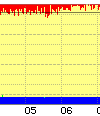
Packet loss on an idle line is always bad news, even if only 1% (one red dot at the top is 1%). If this happens on several lines at the same times of day this usually means congestion on the back-haul to the exchange or elsewhere in the network. If it is steady loss all day it can mean a fault on a line card or interference on the line. Also see: Packet Loss |
|
Long grass
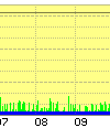
Some issues can be subtle, affecting latency on idle lines like this with occasional peaks. Even low levels of jitter like this can disrupt VoIP and can indicate a wide problem such vendor equipment bugs or the start of back-haul congestion. We have seen some routers (Asus) behave like this, the line is clean when swapping the router. |
|
Speed bumps
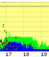
Latency humps like this are normally a sign of back-haul congestion. They normally show on all lines on an exchange or BRAS at once at the same time of day, and only show at certain (busy) times. The clue here is the consistently high latency even when little or no traffic flowing. |
|
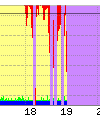
Going off line is shown in purple, and this is often associated with packet loss (red). Where a line has occasional drops they are shown as purple lines. However, in some case a line can deteriorate over a period of time, staying on line less and less until solid purple (off line). On the live graphs a line that is currently off line has a red square in the bottom right corner where as a line that is on-line has a green square. |
|
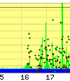
A congested link in the back-haul can show as loss or latency humps on an idle line, but in some cases, like this, it can show only where there is traffic on the line. The symptoms are latency spikes like this (green spikes) even when there is very low usage. Compare to normal graph below. | ||
| Examples of things that are not a fault | |||
|---|---|---|---|
|
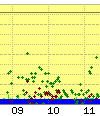
A normal graph shows no packet loss (no red at the top) and little of no change in latency when downloading or uploading at low rates. Compare to congestion graph above. | 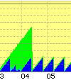
|
This graph has a saw tooth latency pattern. This can sometimes be just in green (peak) latency or in blue (minimum) latency or some combination of the two. It can be regular like this or change frequency. This is just the way this specific make of router responds to LCP echos and is not actually affecting traffic. |
|
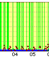
Some makes of router can also cause the occasional LCP echo not to be answered until the next one, causing 1 second latency spikes to appear making green lines like this. This is just the way the router handles LCP echos and is not a problem as such. | 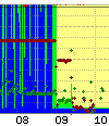
|
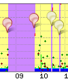
This graph shows very high latency initially, with blue filling the graph (500ms) much of the time and green the rest of the time. However the red line at the same time shows the uplink is being run at full capacity so the latency is just down to the queue in the router. Later the uplink rate is reduced and the latency drops away to a low level with some small peaks. During the high upload you will also notes a few red dots at the top (packet loss) also caused by the upload. |
|
Purple on the graph is off line, and this can be short blips if a line loses sync or longer. Notes (pins) are often added to graphs to explain why a line is off line if we know, especially when we are investigating a fault. The notes on this graph told when the BT engineer arrived and left. | 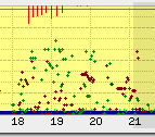
|
Regular drops repeating every day e.g. Central Heating causing drops. View a week of these graphs Here there is interference as the central heating goes on, the drops are regular - twice a day, at the time the heating goes on. This actually highlighted a fault in the central heating for this customer as the graphs showed no drops for 2 days running! |
Regular evening drops
Historical graphs are kept which makes it easy to see patterns is line problems. Here we can clearly see that the line is being affected by something causing it to drop in the evenings. This could be something local causing interference and is less likely to be a PSTN problem. This could be something electrical being used in the evenings, such as putting the dishwasher on after dinner. Knowing that a line drops regularly at a specific time will help diagnose the source of the problem for example, checking what electrical devices are used in the evening.
Faulty Card in a TalkTalk LTS
Here we have three days of graphs, you can see packet loss starting at around 2:50AM, which then gets worse two days later and is then fixed.
This was a faulty line card in a TalkTalk LTS - Only a small number of circuits were affected with packetloss due to this though.
The time ties in with logs from TalkTalk's LTS:
8 alarms currently active
Alarm time               Class  Description
2023-06-29 02:57:46 BST  Minor  FPC 9 Minor Errors
2023-06-29 02:52:29 BST  Minor  FPC 1 Minor Errors
2023-06-29 02:52:25 BST  Minor  FPC 10 Minor Errors
2023-06-29 02:52:23 BST  Minor  FPC 8 Minor Errors
2023-06-29 02:52:22 BST  Minor  FPC 11 Minor Errors
2023-06-29 02:52:22 BST  Minor  FPC 0 Minor Errors
2023-06-29 02:52:22 BST  Minor  FPC 3 Minor Errors
2023-06-29 02:52:02 BST  Major  FPC 10 Major Errors
From 9AM on day 3, the interface that we have with TalkTalk started reporting input discards.
The faulty line card was taken out of service, and the packet loss was no longer.
The incident was: https://aastatus.net/42546
Other Information
Rate limit line - red dot at bottom of graph
BT run a rate limiter for your line at the BRAS. It limits traffic to a set level (typically whole Mb/s) that is below your line sync speed and can change over time depending on your line. We track this BRAS rate and set the CQM system to show this on the graph. It can only gets recorded per hour so shows the highest it was - with a dotted line for the lowest in the hour. You can ask us to limit your line below the BRAS rate - what is shown is the rate we have on the line for you service..
We normally rate limit the line at the same level as the BRAS, i.e. we are not trying to be the bottleneck. We can limit at a lower level if you ask us to. If there is a burst of traffic on your line that would exceed the BRAS rate and mean BT drop packets at the BRAS, then we drop the packet first. By us detecting the burst exceeding the BRAS rate we can (a) show this on the graph as a red dot at the bottom and (b) we can allow small packets such as those used for VoIP to go though when large packets would be dropped (we set a different latency limit for small and large packets). This may still be dropped by the BRAS but typically this has the overall effect of VoIP working well on a full line.
Tracking the BRAS rate is also important for load balancing multiple lines and attack detection.
Here is an example where the download is hitting the limit, and causing the line to drop sync - this may be to do with the router crashing. The graph shows red at the very bottom, indicating the download hitting the limit of the line. At the same time there is a green line near the top which indicated the download, but at the same time there is packetloss (red at the top) and line drops (purple).
Why only 24 hours of history?
Actually, each day, we archive the previous days graphs. This allows us to see a history of a line which is invaluable for intermittent faults or repeat faults.
Why all lines, not just those with faults?
We have to send LCP echos anyway to tell if a line goes off, so we may as well record the data. Sending one every second means we have very detailed information. When a fault does happen we have a full history already available, and this greatly speeds up the process of getting faults fixed. Another important point is that we can immediately see when a fault affects multiple lines as we are monitoring them already. We can even spot faults that our customers have not noticed yet.
Monitoring all lines also allows us to identify core network issues in carriers like BT and get them fixed.
How is this information used?
We make the information available to customers to see their own lines, and dealers (e.g. IT consultants) to help their own clients. We also make the information available to BT in the event of a fault on a line to help them understand the nature of the fault. The graphs allow us to identify many types of faults immediately and so ensure they are fixed more quickly.
I see grey bands on my graphs
In addition to the graphs from the FireBrick we add some extra information. This includes pins on the graph we can add to lines or groups lines to show know issues or events. We also add grey bands to mainland UK graphs which show night and twilight based on your postcode. This allows us to see any light related issues, such as automated security lights with a fault that affects the broadband. It also looks cool.
I pay for usage - what is this monitoring costing me?
The usage based tariffs are metered based on IP traffic. They do not include LCP traffic at all, so these LCP echos are not costing you anything. They do use some of your bandwidth. One ATM cell (53 bytes) is sent each second. On an 8M line this is 0.005% of your downlink bandwidth. Even with limited uplink such as 250kbit/s, only a tiny fraction of a percent of the bandwidth is used for the monitoring.
I have a firewall - will this stop the graphs working?
LCP traffic is not firewalled, and does not go on to your network. Your modem/router must reply to the LCP echo. There are some unusual makes of router that are slow at replying and generate interesting latency graphs which do not reflect the actual delay on the line, but these are rare and easy for our engineers to recognise so as not to mistake for a fault.
Can you really ping every line every second?
The FireBrick FB6000 platform is designed to send and accurately time each LCP packet even when fully loaded. So, yes we can.
CQM Graph options
The control pages have a number of options to allow the graphs shown to be refined. These are shown simply as 8 input boxes. If all input boxes are empty then the standard graph is shown for lines. The standard graph shows 8 traces. You can however input control strings in to these to define up to 8 separate graphs to be displayed instead. This can be particularly useful if you are colour blind, for example. It also allows simplification of graphs which may be rather cluttered, e.g. separating usage from latency in to separate graphs.
The checkbox to the left of the 8 input boxes controls whether the hours of daylight are shown on the graph.
Colour controls
The colour controls use a letter followed by a colour setting. The letter defines which of the 8 traces to show on a graph, and the colour control defines what colour to show.
Each of the 8 boxes is for a graph. Fill in the colour controls from the left box. You can have one graph, two graphs, three graphs, etc. Each graph can have one or more of the 8 traces shown. It is possible to have 8 graphs each with one of the traces on it if you wish.
It is also possible to change the background and text colours.
| Key | Trace |
|---|---|
| m | Min latency |
| a | Ave latency |
| x | Max latency |
| s | Sent |
| f | Failed |
| o | Off line |
| d | Downlink rate |
| u | Uplink rate |
| I | Graticule colour |
| i | Axis colour |
| g | Background colour |
| G | Border background |
| w | Text colour |
Example
For example, if you simply complete the first box as 'max' then you will only get one graph, and it will only have the Min, Ave and Max latency shown. If you complete the second box as 'sfo', then there will be two graphs shown, the second containing only Sent, Fail and Off-line. If you complete the third box as 'du', then there will be three graphs shown - between them displaying all of the 8 traces which are shown together on the standard graph (the third graph showing Download and Upload rates).
To change the colours you include (rrggbb) format colour hex codes after the letter, so if you set a box as m(000000) then that graph will show only the Min latency and show it in solid black.

