CQM Graphs: Difference between revisions
(Created page with "The FB6000 L2TP router provides us with Continuous Quality Monitoring (CQM). This allows us to track the quality of each and every connection in great detail. The router i...") |
m (→Examples) |
||
| Line 15: | Line 15: | ||
==Examples== |
==Examples== |
||
[CQM1.png] |
[[File:CQM1.png]] |
||
The example above show a line with occasional short uploads causing spikes in peak latency, and then a sustained upload starting at around 6pm and causing high latency (queue in the router). At 8pm there was more upload filling the link causing higher latency still and some loss (normal when the link is full). |
The example above show a line with occasional short uploads causing spikes in peak latency, and then a sustained upload starting at around 6pm and causing high latency (queue in the router). At 8pm there was more upload filling the link causing higher latency still and some loss (normal when the link is full). |
||
Revision as of 14:11, 20 September 2013
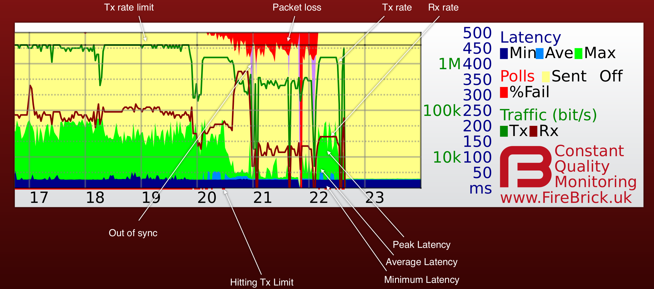
The FB6000 L2TP router provides us with Continuous Quality Monitoring (CQM). This allows us to track the quality of each and every connection in great detail. The router itself produces the graphs in real time, and can also provide csv files with accurate data for each graph.
How does it work?
Our router sends an LCP echo (like a ping) every second while a line is active. Your router replies. We track how long it takes for each reply to arrive, and how many are lost. These results are collated into 100 second samples and shown as a graph like the one on this page. The graph shows us lots of information about the line, and gives a history covering the last 24 hours.
What information is on the graph?
Each column (pixel) represents 100 seconds of samples. The hour of day is shown at the bottom, and the day and date shown next to midnight in the graph. There is additional text superimposed on the graph such as a circuit ID. There are 8 pieces of data shown for each 100 second sample as follows:-
The colours may vary and we even allow users to configure colours individually (useful for people with colour blindness, etc). It is also possible for us to show graphs with only some of the fields which can make some information clearer.
Examples
The example above show a line with occasional short uploads causing spikes in peak latency, and then a sustained upload starting at around 6pm and causing high latency (queue in the router). At 8pm there was more upload filling the link causing higher latency still and some loss (normal when the link is full).

