CQM Graphs: Difference between revisions
| Line 14: | Line 14: | ||
The colours may vary and we even allow users to configure colours individually (useful for people with colour blindness, etc). It is also possible for us to show graphs with only some of the fields which can make some information clearer. |
The colours may vary and we even allow users to configure colours individually (useful for people with colour blindness, etc). It is also possible for us to show graphs with only some of the fields which can make some information clearer. |
||
=CQM Examples= |
|||
===Lots of Upload=== |
===Lots of Upload=== |
||
[[File:CQM1.png]] |
[[File:CQM1.png]] |
||
| Line 39: | Line 39: | ||
If a line is dropping during the day, and maybe just Monday to Friday, then it's probably not going to be an upstream problem. This could be caused by interference of bad wing on site. Check things like the phone line and extensions. Put the router in master socket and to unplug all other phones. Maybe change filter. |
If a line is dropping during the day, and maybe just Monday to Friday, then it's probably not going to be an upstream problem. This could be caused by interference of bad wing on site. Check things like the phone line and extensions. Put the router in master socket and to unplug all other phones. Maybe change filter. |
||
==Other Examples== |
==Other Examples== |
||
Revision as of 15:05, 20 September 2013
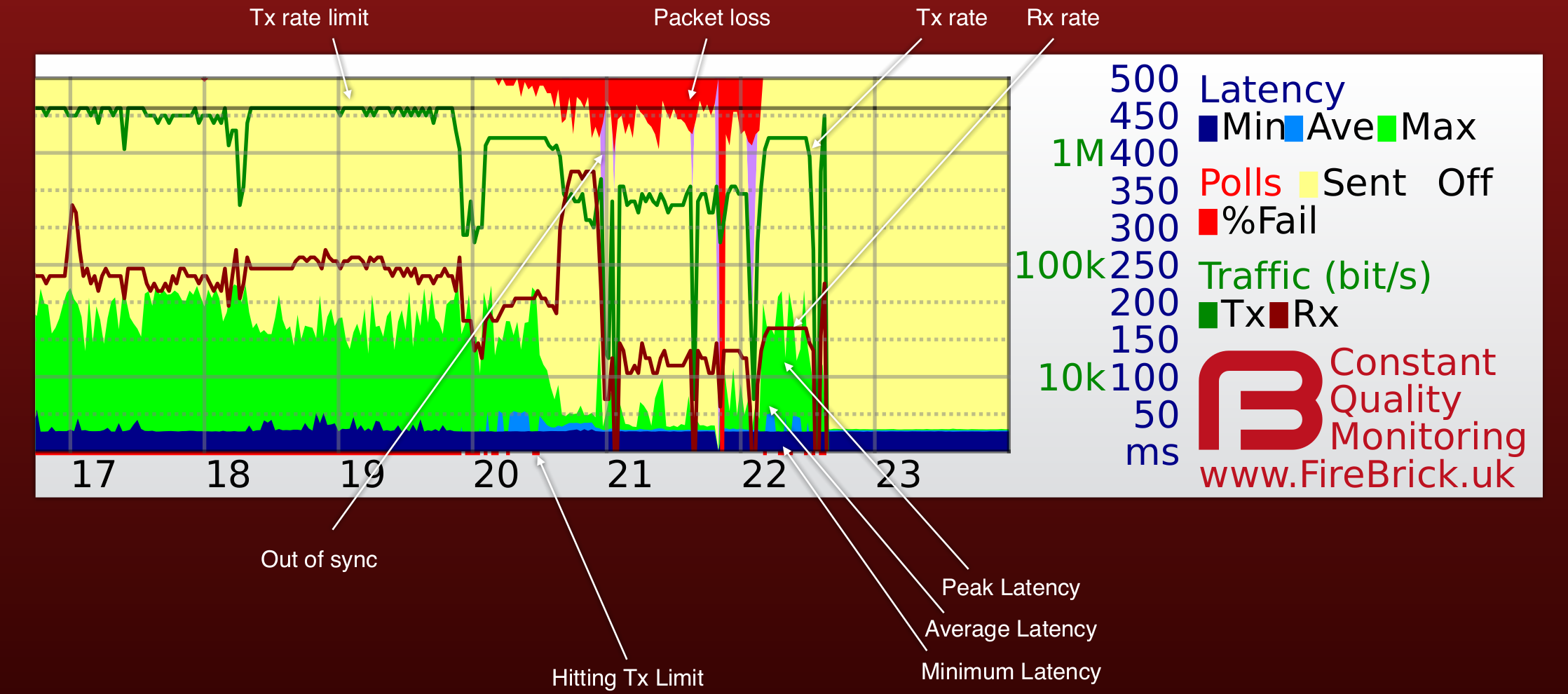
The FB6000 L2TP router provides us with Continuous Quality Monitoring (CQM). This allows us to track the quality of each and every connection in great detail. The router itself produces the graphs in real time, and can also provide csv files with accurate data for each graph.
How does it work?
Our router sends an LCP echo (like a ping) every second while a line is active. Your router replies. We track how long it takes for each reply to arrive, and how many are lost. These results are collated into 100 second samples and shown as a graph like the one on this page. The graph shows us lots of information about the line, and gives a history covering the last 24 hours.
What information is on the graph?
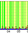
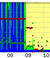
Each column (pixel) represents 100 seconds of samples. The hour of day is shown at the bottom, and the day and date shown next to midnight in the graph. There is additional text superimposed on the graph such as a circuit ID. There are 8 pieces of data shown for each 100 second sample as follows:-
The colours may vary and we even allow users to configure colours individually (useful for people with colour blindness, etc). It is also possible for us to show graphs with only some of the fields which can make some information clearer.
CQM Examples
Lots of Upload
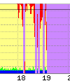
The example above show a line with occasional short uploads causing spikes in peak latency, and then a sustained upload starting at around 6pm and causing high latency (queue in the router). At 8pm there was more upload filling the link causing higher latency still and some loss (normal when the link is full). This is normal.
Redcare
This is an example of a line where the solution was redcare changes
BT Core Network
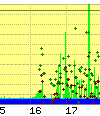
Line showing latency where there is almost no usage. This is an example of a BT core network problem affecting two lines.
Congestion within BT
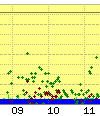
This is down to congestion within the BT core network, this could be at the Exchange, BRAS, or the VP. It would be seen on multiple lines.
Dropping during the day
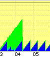
If a line is dropping during the day, and maybe just Monday to Friday, then it's probably not going to be an upstream problem. This could be caused by interference of bad wing on site. Check things like the phone line and extensions. Put the router in master socket and to unplug all other phones. Maybe change filter.
Other Examples
Other Information
Rate limit line - red dot at bottom of graph
BT run a rate limiter for your line at the BRAS. It limits traffic to a set level (typically whole Mb/s) that is below your line sync speed and can change over time depending on your line. We track this BRAS rate and set the CQM system to show this on the graph. It can only gets recorded per hour so shows the highest it was - with a dotted line for the lowest in the hour. You can ask us to limit your line below the BRAS rate - what is shown is the rate we have on the line for you service..
We normally rate limit the line at the same level as the BRAS, i.e. we are not trying to be the bottleneck. We can limit at a lower level if you ask us to. If there is a burst of traffic on your line that would exceed the BRAS rate and mean BT drop packets at the BRAS, then we drop the packet first. By us detecting the burst exceeding the BRAS rate we can (a) show this on the graph as a red dot at the bottom and (b) we can allow small packets such as those used for VoIP to go though when large packets would be dropped (we set a different latency limit for small and large packets). This may still be dropped by the BRAS but typically this has the overall effect of VoIP working well on a full line.
Tracking the BRAS rate is also important for load balancing multiple lines and attack detection.
Why only 24 hours of history?
Actually, each day, we archive the previous days graphs. This allows us to see a history of a line which is invaluable for intermittent faults or repeat faults.
Why all lines, not just those with faults?
We have to send LCP echos anyway to tell if a line goes off, so we may as well record the data. Sending one every second means we have very detailed information. When a fault does happen we have a full history already available, and this greatly speeds up the process of getting faults fixed. Another important point is that we can immediately see when a fault affects multiple lines as we are monitoring them already. We can even spot faults that our customers have not noticed yet.
Monitoring all lines also allows us to identify core network issues in carriers like BT and get them fixed.
How is this information used?
We make the information available to customers to see their own lines, and dealers (e.g. IT consultants) to help their own clients. We also make the information available to BT in the event of a fault on a line to help them understand the nature of the fault. The graphs allow us to identify many types of faults immediately and so ensure they are fixed more quickly.
I see grey bands on my graphs
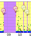
In addition to the graphs from the FireBrick we add some extra information. This includes pins on the graph we can add to lines or groups lines to show know issues or events. We also add grey bands to mainland UK graphs which show night and twilight based on your postcode. This allows us to see any light related issues, such as automated security lights with a fault that affects the broadband. It also looks cool.
I pay for usage - what is this monitoring costing me?
The usage based tariffs are metered based on IP traffic. They do not include LCP traffic at all, so these LCP echos are not costing you anything. They do use some of your bandwidth. One ATM cell (53 bytes) is sent each second. On an 8M line this is 0.005% of your downlink bandwidth. Even with limited uplink such as 250Kb/s, only a tiny fraction of a percent of the bandwidth is used for the monitoring.
I have a firewall - will this stop the graphs working?
LCP traffic is not firewalled, and does not go on to your network. Your modem/router must reply to the LCP echo. There are some unusual makes of router that are slow at replying and generate interesting latency graphs which do not reflect the actual delay on the line, but these are rare and easy for our engineers to recognise so as not to mistake for a fault.
Can you really ping every line every second?
The FireBrick FB6000 platform is designed to send and accurately time each LCP packet even when fully loaded. So, yes we can.
